


Best reports for a category management dashboard
A strong category management dashboard helps you spot changes fast, before small issues turn into missed sales. It’s a set of views built around how category teams actually work — daily monitoring, store-level follow-up, and line review prep — and it only works when the underlying data is clean, aligned, and current.
You have portal access to retailers and grocers, plus distributor feeds like UNFI or KeHE. The hard part is getting those sources to match across the same items, the same stores, and the same weeks. That cleanup can take days. By the time you see the report, you’ve already lost time.
In this guide, ‘dashboard’ means the reporting views your team relies on, no matter what tool you use. Crisp, for example, helps by aligning shelf, sales, and inventory data across 60+ retailers and distributors into a unified clean dataset you can use to build category management dashboard views.
In the sections below, we’ll cover the reports and metrics that help you see why sales changed: distribution, availability, price, promotion, and shelf execution, so you can explain what changed, pinpoint what caused it, and decide what to do first.
Key takeaways:
- Volume alone doesn’t explain performance. Pair it with PODs and sales per POD.
- Availability isn’t just for supply chain. Out-of-stocks cost sales and can chip away at share, so sales teams should have it in their dashboard.
- Getting the data to line up is the hard part. Portals and feeds won’t match without consistent IDs, hierarchies, and calendars.
- Keep ship and scan separate. Sell-in and sell-through answer different questions and shouldn’t be blended.
In this guide, category management ‘dashboard’ means the reporting views your team relies on, no matter what tools you use.
Core modules of a category management dashboard
A dashboard works when it answers the questions category teams ask every week. If it tries to show everything, it slows you down. The best setup is a few simple views that make it easy to spot what changed and where to look first.
Velocity and distribution efficiency
A common mistake is celebrating sales growth without looking at distribution. If sales are up 10% but store count is up 20%, you’re selling less per store than before. That’s why it helps to separate distribution from how well you sell in the stores that carry you. To keep this straight, track two metrics: Points of Distribution (PODs) and Sales per POD.
- Points of Distribution (PODs): One POD is one SKU in one store. If you have three SKUs in 200 stores, that’s 600 PODs. PODs show your distribution footprint across the assortment.
- Sales per POD: A quick read on productivity. If PODs are up 20% but sales are up 10%, you’ve expanded distribution, but the average store is moving less product. If sales per POD is up, you have a stronger case for more facings or more stores.
For line reviews (the regular SKU performance check-in), a simple quadrant chart can make the story clear fast. Put sales per POD on one axis and PODs on the other. High sales per POD with low PODs points to expansion opportunities. High PODs with low sales per POD can flag items that need a fix before you ask for more space.
Availability and lost sales
Availability used to live in supply chain reporting. Now it belongs in the main category view because it shows up as lost sales and, over time, share loss.
Purdue’s Consumer Food Insights survey found that shoppers reported a 9.5% out‑of‑stock rate for foods in 2024. Zooming out to all of retail, IHL Group estimates that inventory distortion, the combined impact of out‑of‑stocks and overstocks, drains about $1.73 trillion in lost value each year. A dashboard should include a clear Lost Sales view that estimates revenue missed due to voids, stockouts, and other inventory gaps at the SKU‑store level.
Lost sales data helps in two practical ways. First, it puts a dollar figure on what’s being missed. If a buyer can see that supply gaps cost the category $50,000, it’s easier to agree on what needs to change in ordering. Second, it helps teams focus. A recurring voids list, filterable by region or banner, shows which stores need attention first.
Price and promotion effectiveness
Promotions can spike sales during the deal week, but not all of that lift is truly new. Some shoppers would have bought the item anyway, just at full price. It helps to estimate base sales (typical non-promo sales) and compare them to promo-week sales. The difference is your incremental lift.
It also helps to track your price index compared to the category’s average selling price for similar items. A price index of 100 means you’re priced at the category average. 80 means you’re priced about 20% below it, and 120 means you’re about 20% above it. For example, if the category average price is $5.00, an index of 80 is about $4.00, and an index of 120 is about $6.00.
Include these indicators:
- Incremental lift: sales above your expected non-promo baseline.
- Subsidized volume: discounted sales that likely would have happened anyway. High subsidized volume can signal inefficient trade spend.
- Promo frequency: how often you’re on deal compared to key competitors.
Planogram compliance and post-reset
A planogram can be updated, and an item can be authorized, but that doesn’t mean it’s on the shelf. The set may not be finished, the product may be in the back room, or inventory may say ‘in stock’ while the shelf is empty. If the shelf doesn’t match the planogram, shoppers can’t find the item and sales won’t show up where you expect.
After a reset, planogram compliance is one of the first things to check. Flag stores where an item is supposed to be on the shelf, but sales never start. If one to two weeks go by and a newly authorized item still shows zero sales, it often points to a set issue, a stocking gap, or phantom inventory (inventory that shows in the system but isn’t on the shelf).
Catching those stores early gives your team a clear follow-up list. It also helps protect new items in the first few weeks, when early sales signals shape what happens next.
A common mistake is celebrating sales growth without looking at distribution. If sales are up 10% but store count is up 20%, you’re selling less per store than before.
Real-time inventory tracking
Retailer and channel reporting differences
Most category dashboards track the same core signals: sales, distribution, velocity, and availability. What changes is how each retailer or channel defines those signals and how often the data updates.
Some retailers put heavy weight on on-shelf availability (OSA%) and purchasability measures such as PEAT (Published, Eligible, Available, Transactable). Others use Walk-In Purchasability (WIP%) and Digital Purchasability to reflect whether an item is truly buyable in-store and online. The names differ, but the idea is the same: it’s not enough to be listed or “in inventory.” Shoppers have to be able to purchase the item in the moment that matters.
Distributor reporting adds another wrinkle. Distributor data often updates less frequently and may reflect depletions (warehouse-to-store movement) rather than register scans. That makes it useful for spotting regional buildup or gaps, but it shouldn’t be treated the same as daily retailer scan data.
How to manage it in a dashboard:
- Label the source on every chart (retailer scans, distributor depletions, and shipments), so people don’t mix signals.
- Align timeframes before comparing performance (same weeks and calendar across accounts).
- Keep like-with-like views: compare retailer scan data to retailer scan data, and use distributor data for distributor-specific reads.
These basics keep the story consistent, even when retailer definitions and refresh timing differ.
Most category dashboards track the same core signals: sales, distribution, velocity, and availability. What changes is how each retailer or channel defines those signals and how often the data updates.
Don’t mix ship and scan data
Dashboards get confusing fast when you mix data that isn’t measuring the same thing. Most CPG teams are looking at two types of data at the same time: ship and scan data. The key is keeping them straight.
- Ship (sell-in): what you shipped to a retailer or distributor
- Scan (sell-through): what shoppers actually bought at the register.
Both are useful, but they answer different questions. A shipment spike can mean a retailer is building inventory, not that shoppers are buying more. That’s why category trends and market share changes should lean on scan data when it’s available.
How to use them together without confusion:
- Use shipment data for inventory flow and revenue timing.
- Keep ship and scan on separate charts, or clearly separated lines.
- Use scan data for category trends, velocity, and market share.
- Clean, enriched product data isn’t a nice-to-have. It’s what makes automation outputs usable and credible in retailer reviews.
Avoid apples-to-oranges comparisons
Even within scan data or within shipments, formats vary. One source may report units per store per week, while another reports cases per region per month. Before you compare performance across accounts, normalize the basics:
- Match the same time period (same weeks and calendar)
- Convert units so you’re comparing like with like
- Note what each source includes and excludes
If one source is a four-week period and another is a calendar month, trends and share can look off even when nothing has changed.
A shipment spike can mean a retailer is building inventory, not that shoppers are buying more. That’s why category trends and market share changes should lean on scan data when it’s available.
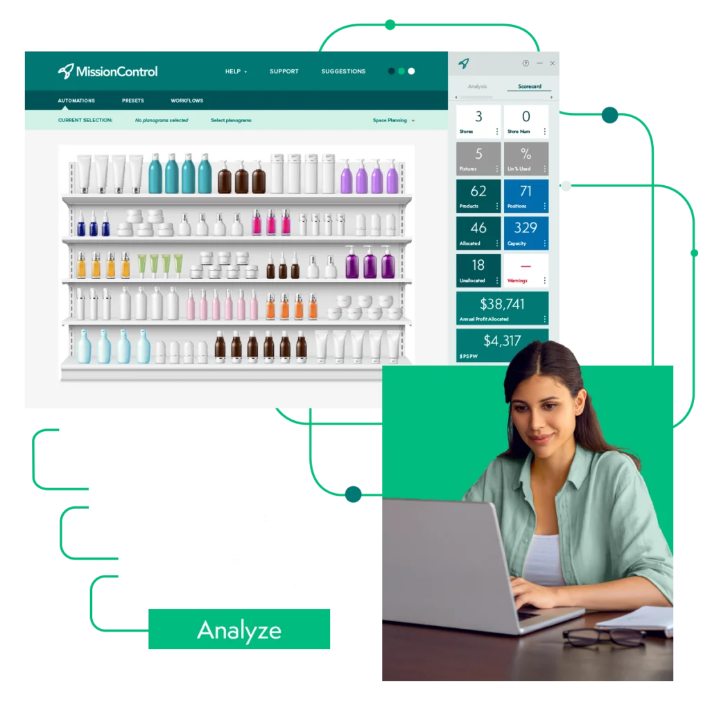
Category management technology with Crisp MissionControl
The digital shelf in a category dashboard
Category work doesn’t stop at the physical shelf. Online listings also need to be easy to find and easy to buy. Retailers increasingly track whether items are truly purchasable online, not just listed.
A simple dashboard check is to compare in-store and online performance. If an item sells well online but lags in stores, you may have a store execution or placement issue. If it sells well in stores but struggles online, the issue is often digital, like search visibility, content gaps, or online availability.
Add a digital health view that tracks:
- Online availability: Whether the item is available to purchase and fulfill
- Listing quality: Are images, titles, and key details complete and accurate?
- Ratings and reviews: Review count and star rating trends over time
Why category reporting in Excel fails
A lot of teams try to build these dashboards in spreadsheets first. They pull files from multiple retailer portals and distributor reports, clean up columns, match SKUs, and then paste the results into a deck.
The problem is speed and consistency. If you’re updating weekly, the spreadsheet often shows you the issue after the week is over. That can be too late to fix an out-of-stock or course-correct a promo while it still matters. Manual work also creates risk. If weeks don’t line up, an ID match fails, or a formula breaks, the dashboard can tell the wrong story.
AI agents and governance for category management
Agentic AI is moving from experiments to day-to-day execution. Deloitte reports that nearly 68% of retail executives expect to deploy agentic AI within the next 12 to 24 months, and 44% say legacy systems are already slowing down innovation. That combination is why the AI question in category tech has shifted from capability to control — can teams trust it, govern it, and explain its decisions?
Crisp frames this well: AI Agents should sit on a retail-specific semantic layer and knowledge graph, so insights are grounded in consistent definitions and business logic, not loose interpretation. That means agents can automate recurring work like Monday Morning reporting, flag out-of-stock risks, and surface distribution or assortment opportunities while still showing their work.
When you evaluate AI agents, focus on control and accountability:
- Traceability: Can you see what data and logic drove the recommendation?
- Guardrails and approvals: Can you set thresholds and require sign-off for bigger changes?
- Audit history: Are recommendations and actions logged so teams can review outcomes over time?
- Permissions: Can access and actions be limited by role and responsibility?
AI can absolutely speed up category work. But the winners will be the teams that pair automation with clear guardrails so faster decisions don’t turn into faster mistakes.

Grow retail revenue with real-time data
How Crisp fits into the category management dashboard workflow
Crisp is the data layer behind the views category teams use every week. It pulls sales, inventory, and availability data from retailers and distributors, then aligns them across items, stores, and calendars. Crisp isn’t a category management dashboard platform. It provides clean, aligned data teams can use to build dashboards in the tools they already have, or leveraged with agentic AI technology. The goal is faster, consistent reporting that drives store-level action.
A strong category dashboard keeps the focus on what needs attention now. It helps teams spot when velocity drops, pricing shifts, or distribution gaps start to impact share. With Crisp as the data layer, teams can build the category management dashboard views they rely on, prioritize the right stores and SKUs, and walk into buyer conversations with a clear read on what changed. That speed helps teams act before missed sales pile up.
With Crisp as the data layer, teams can build the category management dashboard views they rely on, prioritize the right stores and SKUs, and walk into buyer conversations with a clear read on what changed.
FAQs about category management dashboards
-
What are the most important metrics to include on a category management dashboard?
Start with sales, PODs (Points of Distribution), and sales per POD to separate distribution gains from true velocity. Add availability and lost sales so you can see when gaps are costing revenue. Then layer in price and promotion results, including incremental lift, so you can tell whether promos are creating new sales or just discounting what would have sold anyway.
-
How often should a category dashboard be updated?
Daily updates are ideal when retailers provide daily scan and inventory signals, especially for availability and execution issues. Weekly rollups are still useful for trend views and line review prep. Many teams use both: daily for exceptions and weekly for the story.
-
Can I mix distributor data with retailer scan data?
Yes, but not in the same metric. Distributor data often reflects depletions or shipments, while retailer scan data reflects shopper purchases. Keep them on separate charts or clearly separated lines, and align calendars before you compare trends.
-
How do I know if a sales dip is demand or an execution problem?
Check availability signals first. If PODs are stable but sales per POD drops, the issue may be pricing, promo, shelf execution, or availability. If availability is down or you see zero sales at authorized stores, it often points to out-of-stocks, shelf problems, or phantom inventory.
-
What’s a practical way to track new items after a reset?
Watch for stores where the item is authorized but sales never start. If one to two weeks pass with zero sales, flag those locations for follow-up. It’s a simple way to catch set issues early, before early sales signals work against the item.
Get insights from your retail data
Crisp connects, normalizes, and analyzes disparate retail data sources, providing CPG brands with up-to-date, actionable insights to grow their business.